Wicked Sidekick
Design System Foundation
Built a token system, component library, and Storybook documentation for an AI-powered B2B SaaS product – in one week
Wicked Sidekick
Wicked Sidekick is an AI-powered B2B SaaS tool that helps Product Managers analyze customer meeting transcripts and surface insights. The product was pre-revenue, built part-time by a team of former Brightcove engineers and a PM, with active feature development happening in parallel.
I was brought in as the lead designer. Before touching a single component, I audited the codebase, surveyed the competitive landscape, and developed a visual direction. Then I built the foundation of the design system from the ground up.
Wicked Sidekick
Product Designer
Lead & Only Designer
Competitive research, visual direction, design tokens, component library, Storybook documentation, frontend implementation
David (Product Owner), George (Dev Lead)
March 2026
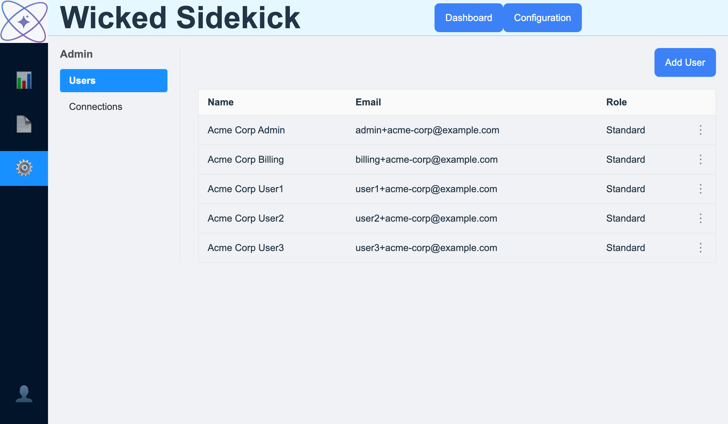
The existing frontend was a working React 19 app, but lacked design direction or a design system. The component inventory was thin: four hand-rolled components and twenty-eight CSS files with inconsistencies and hardcoded values everywhere. Every new view required guessing at values and rebuilding common patterns from scratch. There was no real brand identity.
Before touching any code, I surveyed the branding of many AI meeting tools – Gong, Fireflies, Jamie, Krisp, Fathom, Otter, tl;dv, Read.ai, Fellow, Granola, and more. The findings shaped the visual decisions that followed.
Almost nobody does warm. Fonts are a sea of sameness – Inter, DM Sans, Work Sans, Poppins. There’s wide-open differentiation space in warm palettes and distinctive type.
The original color palette included blue and purple. The intent - trustworthy, with a dash of creativity - was good but needed refinement. I was determined to add warmth and a human element while standing out in the competitive landscape.
Blue stayed as the anchor, but shifted from the generic #4A90E2 to a deeper gem tone – sapphire over sky blue. Purple from David’s spec moved into the neutral palette instead of competing as a spot color: every gray carries a hint of dusty violet, giving the whole UI a warm, slightly blush quality without putting us in the most crowded lane in the market.
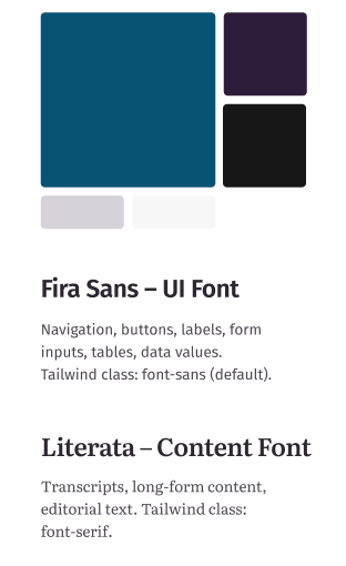
Fira Sans for the UI – humanist warmth that Inter lacks, not overused in the SaaS space. Literata for transcripts and content – designed for extended reading, with a sans/serif split that creates a clear UI / content hierarchy nobody else in this market does.
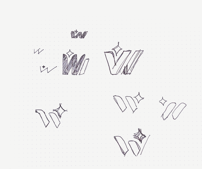
The existing logo was a placeholder – generic enough to be mistaken for the React logo. I designed a new mark that reflects the product’s identity: something distinctive, purposeful, and built to last beyond MVP.
The goal from the start was to get something professional-grade into the team’s hands fast – not by building from scratch, but by leveraging what already exists. Active feature development was happening throughout; the approach had to be purely additive. Nothing breaks. No rewrites. Each story a self-contained PR.
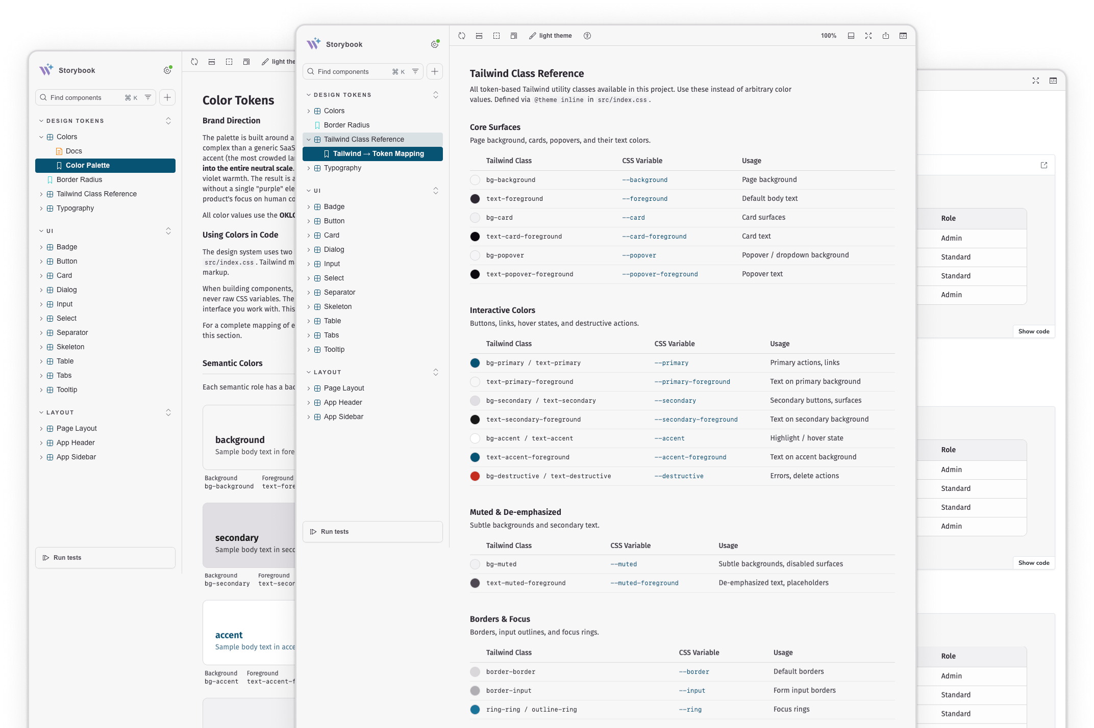
Single source of truth for all design tokens. The codebase already had dead Tailwind classes – the intent was there. And AI tools are extremely fluent in Tailwind, so tokens mean every engineer’s AI stops inventing hex codes and starts using the palette.
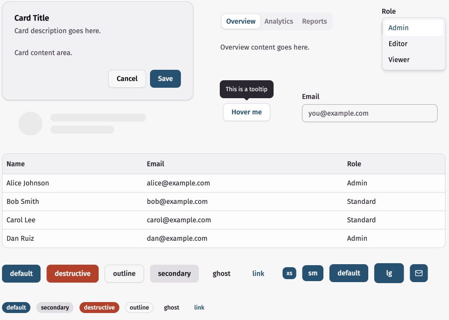
A code generator, not a dependency. Components land as source code you own, built on Radix UI primitives – keyboard navigation, focus management, and screen reader support included. The team inherited professional-grade accessibility without spending a sprint on it.
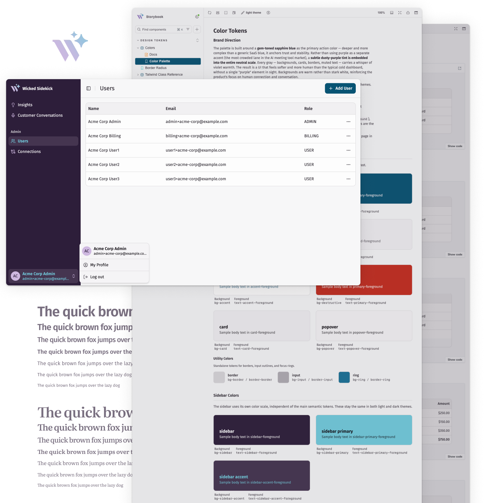
Living documentation for the component library – and the artifact that makes this case study possible.
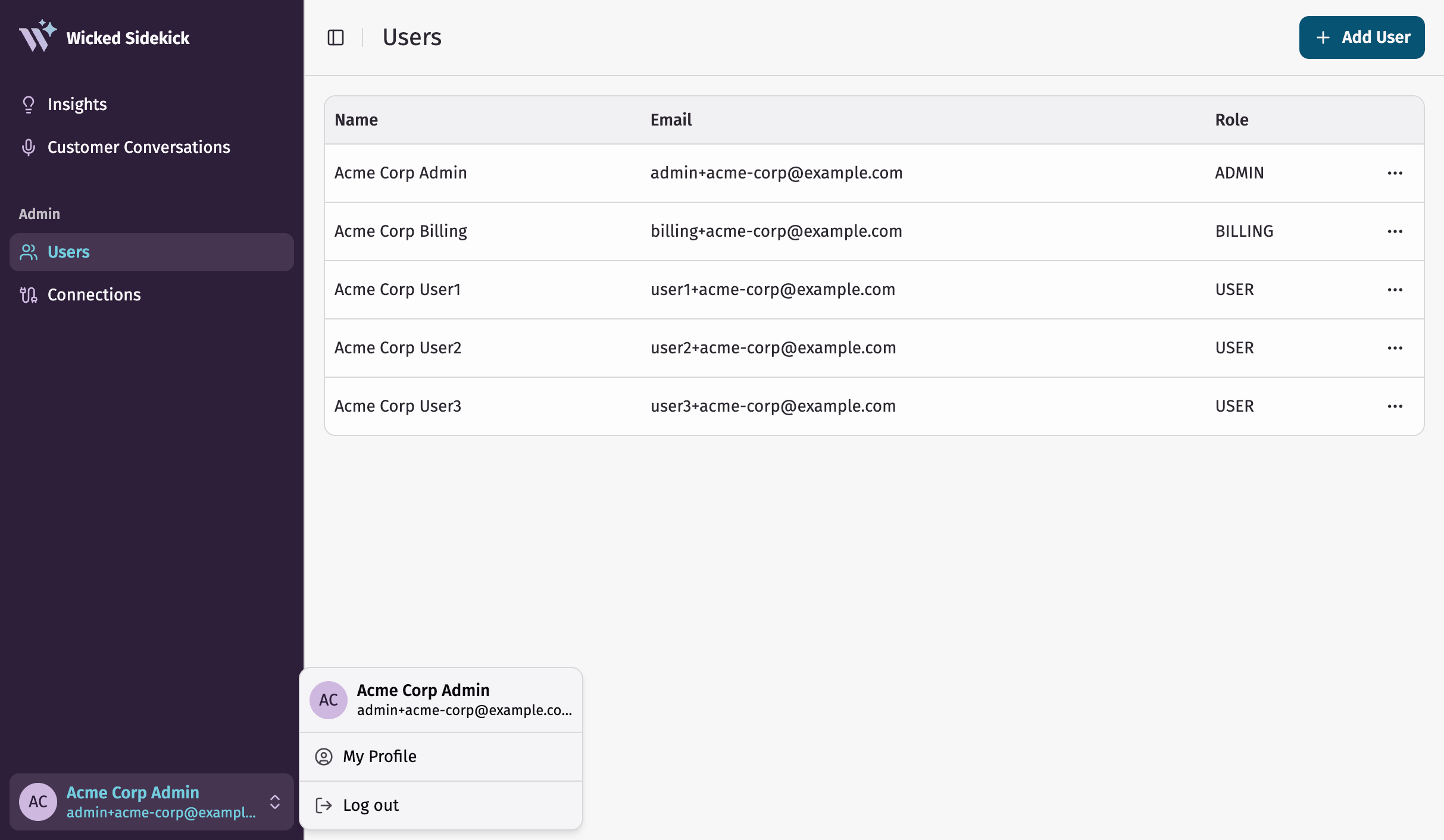
Nine stories, each a self-contained PR. Purely additive until Story 5 – Mikey shipped features the entire time.
Stories 1–2
Full token system configured in Tailwind. ~15 shadcn components installed into a new directory alongside existing code – zero collision.
Story 3
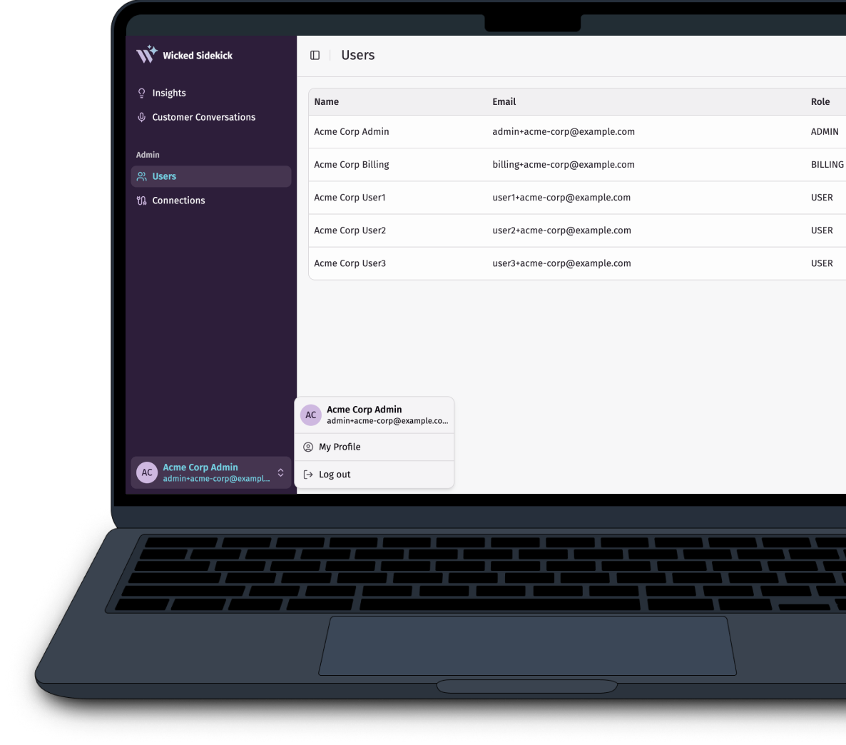
Hand-rolled sidebar and topbar replaced with shadcn’s sidebar. Layout-level change: every view updated at once. The strongest single before/after in the project.
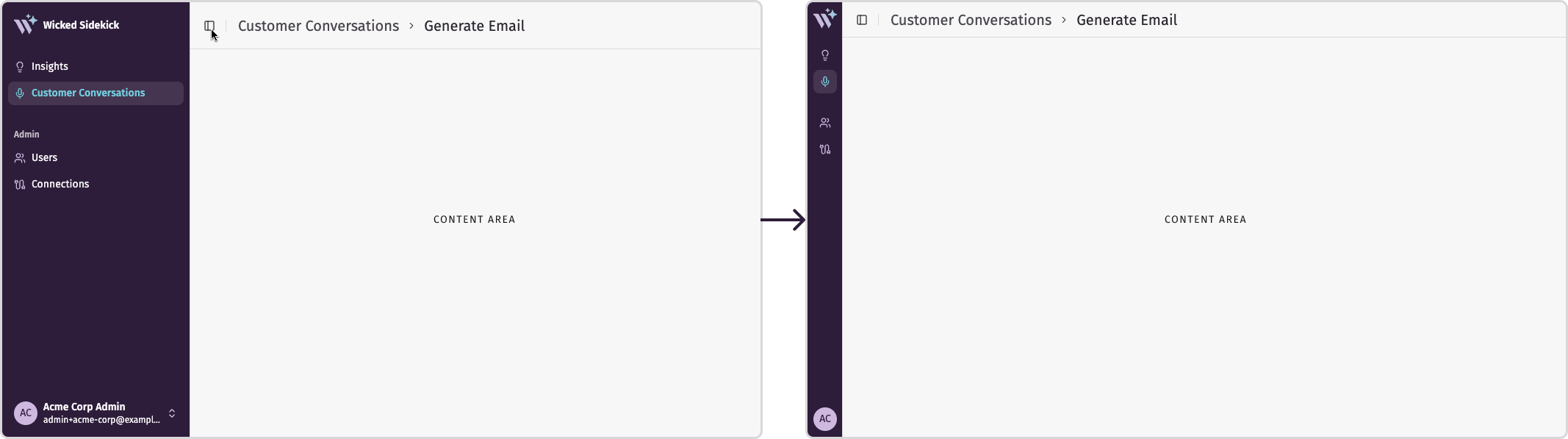
AppSidebar and AppHeader. The sidebar supports a collapsed state – shown here mid-transition.Story 4
Component stories, token documentation, and a full Tailwind token class reference – what’s available and what it resolves to.
Story 5+
The reference view – the template every future migration follows.
As I said when I saw this earlier, this is awesome 🔥 Leveraging libraries and AI to build with speed. If there are people who has not been a part of building out design systems, what Colin has built would have taken a team at least a quarter (to get agreement in the design team + engineering time to build)